Let’s be real: you want that “did a stylist just swing by?” table without sacrificing your next three paychecks. Good news—spring is the perfect season to fake a luxe look on a thrift-store budget. Think fresh textures, delicate color, and clever layering that feels intentional, not try-hard. Ready to turn your table into the star of your space? Grab a vase (or a jar—no judgment) and let’s make some magic.
1. Layer Soft Neutrals, Then Pop With Pastel

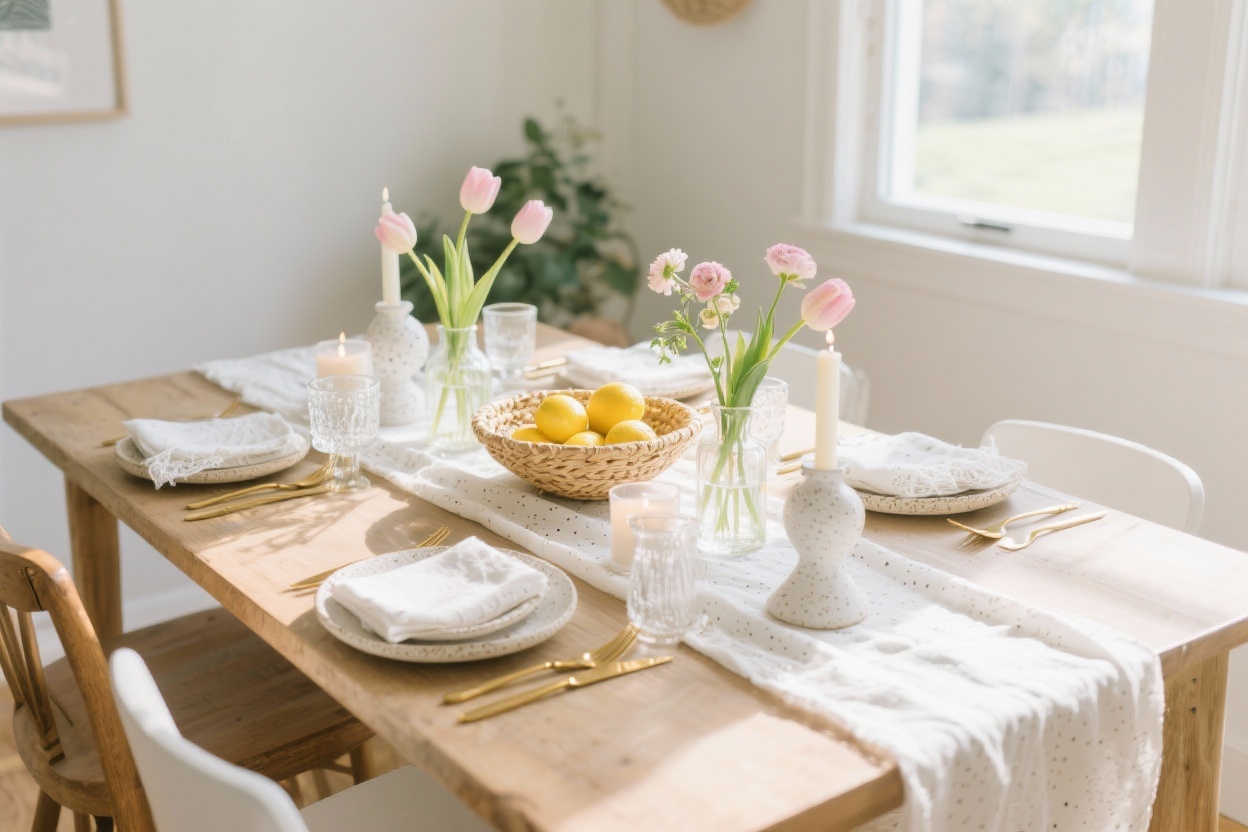
Nothing says “expensive” like layers. Start with a calm, **neutral base**—think creamy linens, warm taupe, or soft gray—and then sprinkle in **one or two pastels** for that spring energy. The trick is restraint. A little blush pink or pale sage goes a long way.
Build Your Base
- Table runner > placemats > napkins: Stack these in soft neutrals for depth without chaos.
- Mix textures: Linen runner, woven placemats, cotton napkins. Texture reads “custom” even if it’s from the clearance aisle.
- Keep patterns subtle: Micro-stripes or a tiny check are chic and won’t fight your centerpiece.
Add Your Spring Accents
- Choose one pastel for napkins or candle tapers—blush, butter yellow, lavender, or robin’s egg blue.
- Slip in matte ceramics or stoneware in similar tones for a designer feel.
- Use gold or brass flatware (even faux) to warm everything up—instant upgrade, FYI.
Pro tip: Keep your color palette to 2 neutrals + 1 pastel. It looks curated, not chaotic.
2. Elevate With Grocery Store Flowers (The Luxe Edit)

Florist bouquets are gorgeous, but your local grocery store has everything you need—if you edit like a pro. The secret? **Monochrome bunches** and thoughtful vessels. Skip the mixed bundle chaos and go for calm, sculptural simplicity.
How To Style Budget Blooms
- Stick to one flower type per vase: All tulips, all daffodils, or all ranunculus = chic and intentional.
- Go monochrome: One color family feels expensive. White always wins, but soft pink and buttery yellow are perfect for spring.
- Trim low and let them breathe: Cut stems at varying heights so they fall naturally. Loose and airy looks designer.
- Cluster small vases: Three bud vases look way more high-end than one overstuffed arrangement.
Use What You Have
- Repurpose jam jars, vintage bottles, or ceramic pitchers as vases. Mismatched is charming when the flowers match.
- Try a fruit + flower combo: lemons or pears in a shallow bowl next to a small floral cluster is minimal, fresh, and very “editorial.”
Pro tip: Remove the leafy greens. Stems and blooms only. It keeps the look clean and modern (and pricey—IMO).
3. Candlelight, But Make It Daytime

Yes, candles are for brunch. The glow softens everything and instantly dresses up your table. The key is choosing tapers and tea lights in soft shades and mixing heights for dimension.
The Candle Strategy
- Use tall tapers for drama and low tea lights for sparkle—no one wants a centerpiece they can’t see around.
- Color matters: Try pale mint, buff, blush, or ivory. No neon. We’re going for moneyed minimalism, not birthday party.
- Mix holders: Brass, glass, and ceramic can all play together if the shapes are simple.
Layout That Looks Intentional
- Asymmetry is your friend: Group 2-3 tapers on one side, balance with a low bowl or florals on the other.
- Runner hack: Place candles only along the runner to guide the eye and avoid clutter.
- Safety note: Keep flames away from foliage and each other. Singed tulips are not a vibe.
Pro tip: If you hate drips, go for dripless tapers and tuck a few clear unscented tea lights in glass for sparkle without the mess.
4. Mix High-Low Dinnerware Like a Stylist

Here’s where we fake the splurge. Use your everyday basics, then layer in one elevated element—chargers, napkin rings, or a single artful plate. The contrast looks curated and totally intentional.
Your High-Low Formula
- White dinner plates as the base—classic and clean.
- Add rattan or jute chargers for texture (vintage or big-box finds both work).
- Layer a patterned salad plate—gingham, ditsy florals, or painterly dots scream spring without going full cottagecore explosion.
- Finish with cloth napkins and a simple napkin ring (brass, marble, or knotted twine with a sprig of herb).
Little Luxuries That Cheat the Look
- Matte flatware (black or brushed gold) instantly modernizes.
- Water goblets + stemless wine glasses: Mixing silhouettes feels layered and editorial.
- Place cards on textured paper—even if it’s just the two of you. Chic is a mindset, FYI.
Pro tip: Keep your plate stack to 2-3 pieces max. Anything taller starts to feel like pottery Jenga.
5. Style a Seasonal Centerpiece That Isn’t a Bouquet

Let’s break free from the floral rut. A spring table can feel lush and expensive with unexpected materials—think branches, produce, or a curated vignette. It’s sculptural, affordable, and totally memorable.
Centerpiece Ideas That Look $$$
- Branch moment: One tall branch (cherry, quince, or magnolia) in a simple vase. High impact, low cost.
- Nested bowls: Stack two bowls—a large one with moss or linen, a smaller one with painted eggs, citrus, or quail eggs. Subtle, not cutesy.
- Herb garden runner: Line the center with small pots of rosemary, thyme, and mint. Smells amazing and doubles as take-home favors.
- Textural trio: A ceramic pitcher, a low marble bowl, and a glass bud vase. Different materials, same palette = designer energy.
Composition 101 (So It Doesn’t Look Random)
- Rule of thirds: Arrange in clusters of three—one tall, one medium, one low.
- Negative space is chic: Don’t fill every inch. Breathing room makes everything look intentional.
- Repeat materials: If you use brass once, echo it in a candleholder or napkin ring. Repetition = cohesion.
Pro tip: If branches feel too dramatic, try a single low bowl filled with lemons and one small vase of greenery beside it. Minimal, fresh, and photogenic.
Bonus: Quick Pull-Together Checklist
- Linen runner in a soft neutral
- White plates + textured chargers
- Pastel napkins with a simple ring
- Cluster of monochrome grocery-store blooms
- Two taper candles + three tea lights
- One sculptural centerpiece element (branch, bowl, or herbs)
Do these five things and your table will look like it belongs in a spring catalog—without the catalog prices. Keep the palette simple, mix textures, and let a few thoughtful details shine. You don’t need a new dining set or a florist on speed dial—just a little editing, some everyday pieces, and a sprinkle of seasonal charm. Now light those candles and invite your favorite people over. Your table’s ready for its close-up.